Great Scott Vintage
thrift store branding
2022 • identity, branding, illustration
Great Scott Vintage is a curated vintage brand that blends rugged charm with playful nostalgia. I designed and developeda full identity system that reflects a spirit of exploration, character, and story-driven retail.
Rooted in a modern yet nostalgic tone, the brand draws from the American West and vintage storefront culture, offering apparel, collectibles, and lifestyle goods. The process included mood alignment, custom illustrations, logo refinement, and a flexible type system—resulting in a confident, expressive identity that scales seamlessly across packaging, signage, and digital platforms.


Process
Initial ExplorationFor the first round of logo development for Great Scott Vintage, I led the creation of two distinct visual directions, each grounded in strategic insights drawn from client discussions and moodboards.
★ Direction A - Modern, Bold, Playful
Clean illustrations, playful badges, and bold accessible typography combine to create a tone that’s approachable, confident, and light-hearted.
Direction B - Vintage, Weathered, Storied
Textured illustrations, retro Americana influences, and worn typography create a rugged, character-rich tone with history and authenticity.
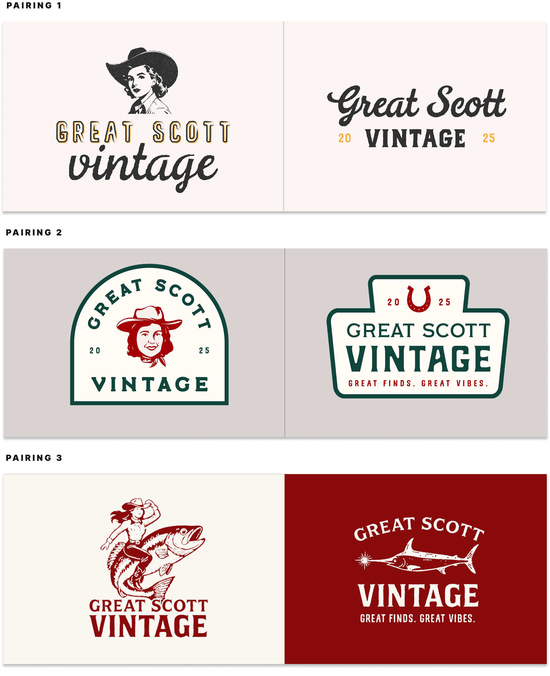
Round 2 ExplorationBuilding on the client’s choice of Direction A—a bold, modern, and playful identity—Round 2 explores a richer narrative rooted in vintage Americana, western charm, and personal heritage.
References to the client’s grandmother add warmth and sentiment, while the iconic fish lamp grounds the work in a more product-driven tone. This round investigates how variations in style, typography, color, and layout can shift tone without breaking visual cohesion.
Direction 1 - Confident & Impactful
A bold, high-contrast system with rounded type and nostalgic illustrations inspired by Americana signage.

Direction 2 - Soft & Modern
Clean typography and monoline illustrations paired with a soft, earthy palette. Calm and contemporary with subtle vintage influence and a warm, approachable tone.

Direction 3 - Sweet & Feminine
Playful and nostalgic with pink-forward tones, retro type, and mid-century details.

Direction 4 - Editorial & Collected
Refined serif and script typography, cooler tones, and stamp-like illustrations. Minimal, timeless, and rooted in storytelling with a quiet confidence.

★ Direction 5 - Bold & Spirited
A rugged yet clean system inspired by vintage Western graphics. Strong slab serif type, simple illustrations, and a grounded palette evoke adventure and heritage.

Round 3 ExplorationInformed by client feedback from Round 2, this phase focused on refining the selected direction. The system was expanded to include flexible secondary marks, refined typography, and explorations of color palette that balanced warmth, boldness, and vintage charm.


Finalization
Primary Logomarks
The primary logos are bold, memorable marks that form the foundation of the brand identity. The fish lamp is graphic and iconic—ideal for high-visibility applications like signage and packaging—while the logo of Grandma Jerry introduces a warm, illustrative tone that adds personality and nostalgia to the system.

Supporting Logomarks
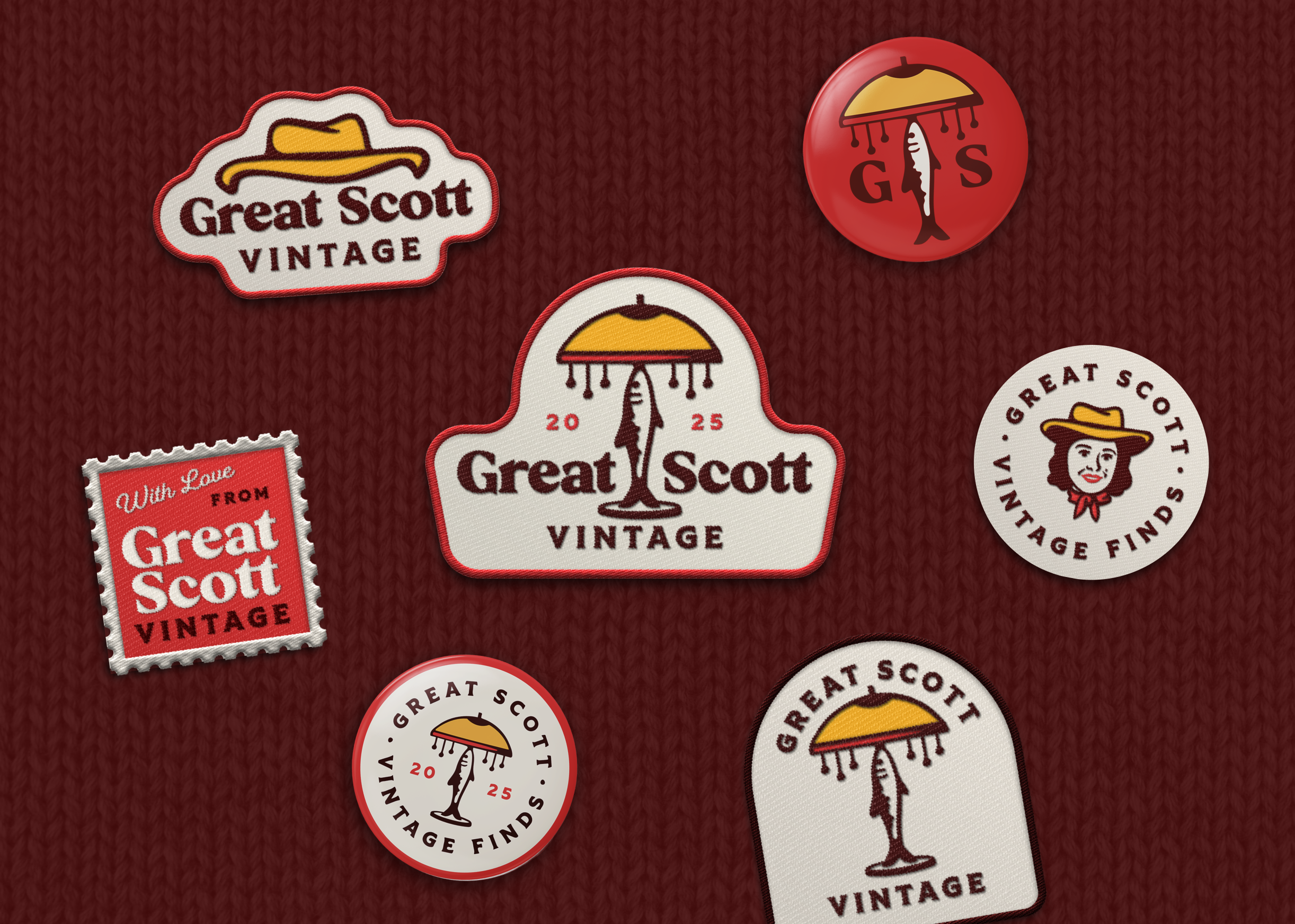
These supporting logos enhance the brand’s flexibility across a range of applications. The set includes marks suited for side placements on packaging, signage, and smaller brand touchpoints. It also features a compact, circular option ideal for use as a stamp, icon, or profile image.

Wordmark & Typography
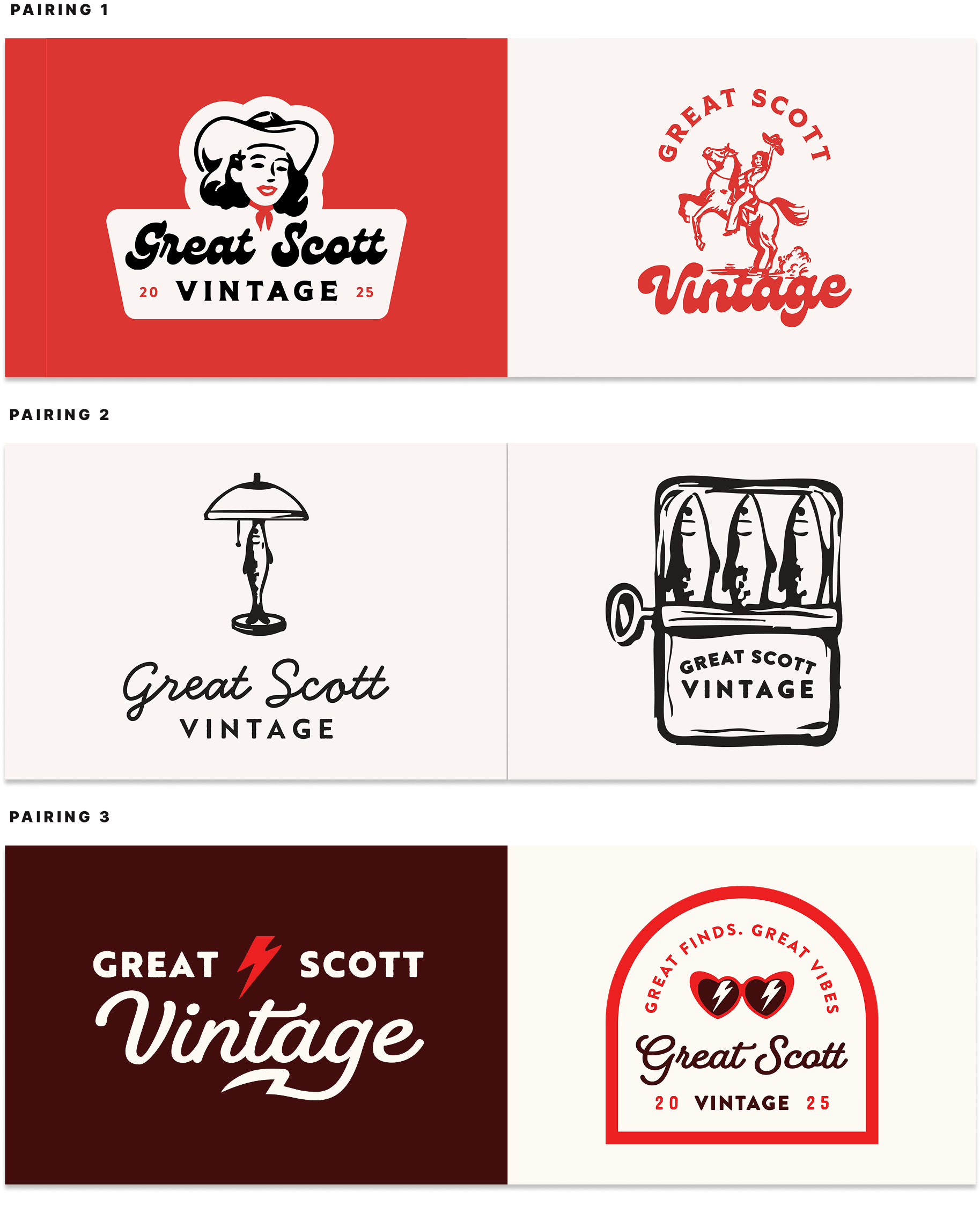
The Great Scott Vintage wordmark uses the typeface Bachelor for its bold, retro-inspired personality—playful yet refined. Letterforms were customized for better balance and brand distinction. Paired with Tiller as a secondary typeface, the system achieves a clean, versatile contrast.

Color Palette
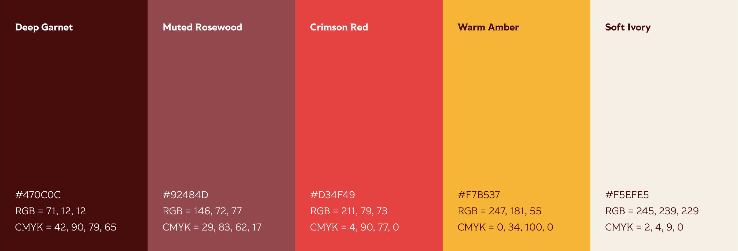
This palette blends rich neutrals with warm accents and soft undertones, creating a balanced and inviting aesthetic. It evoke a sense of nostalgia and familiarity, creating designs that feel timeless and approachable.
